Microsoft Teased A New UI For Windows 10 And It's Stunning
Dhir Acharya - Mar 23, 2020

To celebrate the 1 billion device mark of Windows 10, Microsoft released a teaser video showing how the new UI will look like. And it's promising!
- Windows 11 is Now the Most Popular Desktop OS in the World
- The Ultimate Tech Betrayal: OpenAI's Nuclear Revenge Plot Against Sugar Daddy Microsoft
- Microsoft Notepad Gets Major Update: Bold Text, Hyperlinks, and Markdown Support
Microsoft has been hinting on a revamped Start menu for Windows 10. But the company has now released a teaser for the next refresh of Windows 10 UI to celebrate its 1-billion mark. The teaser was posted on Instagram by the chief product officer of the tech giant, Panos Panay.

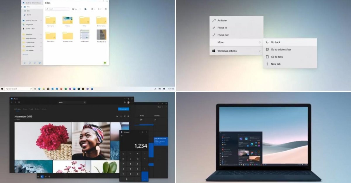
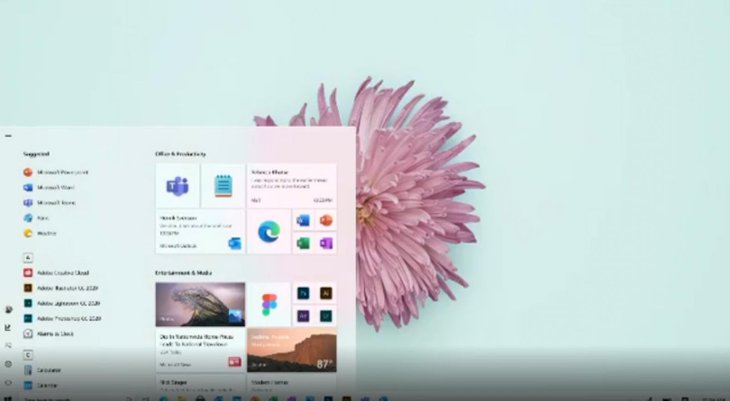
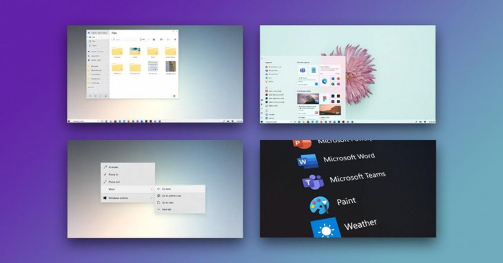
The video starts with an illustration of Windows’ evolution over the years from Windows 1.01 to Windows 10. But the interesting things begin at the twelfth second when Microsoft shows a set of new icons, then a redesigned look for the Live Tiles and Start Menu in the operating system.
The company has replaced the brightly colored, rectangular icons with more unified colors that change automatically in accordance with your desktop background. The icons may potentially change based on other interface elements too.

Besides, the video also unveiled a wide range of options for accessibility including pointers in various colors and sizes, which could better support the Xbox Adaptive Controller, a new built-in snipping tool, etc.
The video then capped off everything by revealing the light and dark themes for Windows 10 as well as other options for snapping and resizing to make multi-tasking easier and faster. The tech giant also mentioned support for ARM-based systems such as the Surface Pro X and x86-based systems that are powered by AMD and Intel chips.
Overall, the upcoming changes in Windows 10 UI look promising as it seems to offer a sleeker and more streamlined interface that’s in line with the Fluent design language Microsoft introduced in 2017. One of the biggest complaints about the operating system right now is the UI, which seems disjointed as it tends to look like Windows XP when users dive in deeper and deeper. Meanwhile, the new Start menu comes in a cleaner, more moderns design.
Another big tweak is that Windows seems to de-emphasize Live Tiles, which have caused troubles for many users for a long time. As Windows 10X has ditched Live Tiles, the new UI of Windows 10 may do the same.
>>> Windows 10 Now Has 1 Billion Users Around The World
Featured Stories

ICT News - Apr 13, 2026
DDR4 RAM Prices Finally Fall After Soaring More Than 2,200 Percent

ICT News - Apr 06, 2026
Artemis II Crew Enters Moon's Gravitational Sphere on Historic Day 5

ICT News - Mar 31, 2026
DDR5 RAM Prices Finally Easing: Relief for PC Builders in 2026

ICT News - Mar 29, 2026
FTC Takes Action Against Debanking Practices by Major Financial Firms

ICT News - Mar 27, 2026
Palantir CTO Identifies Iran Conflict as First Large-Scale AI-Driven War

ICT News - Mar 24, 2026
OpenAI on the Brink: Major Setbacks Signal the Bursting of the AI Bubble

ICT News - Mar 20, 2026
Top 10 Most Popular Social Media Sites Based on User Count in 2026

ICT News - Mar 19, 2026
Billion Dollar Blunder: Meta Shuts Down Metaverse After Wasting $80,000,000,000.00

ICT News - Mar 18, 2026
X to Introduce Regional Controls for Posts and Replies

ICT News - Mar 17, 2026
Is DLSS 5 Helping Games or Hurting Developers' Creative Style?
Read more

Mobile- May 03, 2026
Samsung Galaxy S26 vs OnePlus 15T: Which Compact Flagship Wins in 2026?
Which phone are you leaning toward? Let us know in the comments.
Comments
Sort by Newest | Popular