Amazon's Redesigned Logo Looked Like Hitler's Mustache
Dhir Acharya - Mar 04, 2021
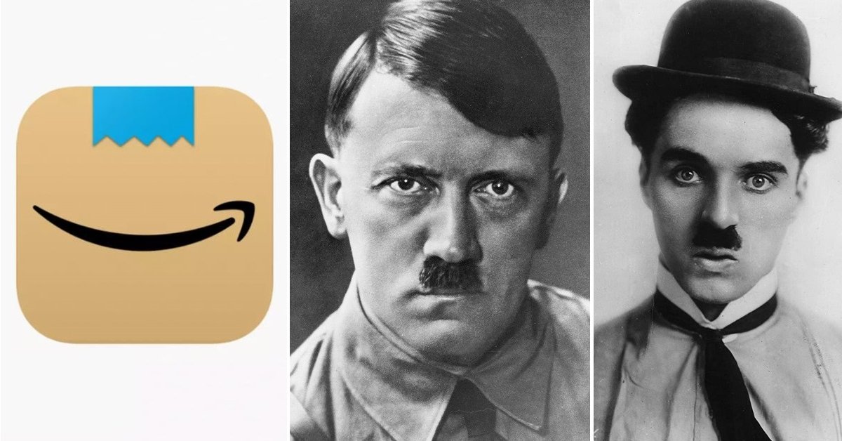
Shortly after changing its mobile app logo, Amazon had to make another change as the new logo is compared to Hitler’s mustache.
- Jeff Bezos Stopped Mukesh Abmani's $3.4 Billion Deal To Protect His Dominance
- Jeff Bezos Led Amazon To Success With These 14 Principles
- Jeff Bezos To Step Down As Amazon CEO This Year, Replaced By Andy Jassy
Shortly after changing its mobile app logo, Amazon had to make another change as the new logo is compared to Hitler’s mustache. In January, the e-commerce giant launched a redesigned logo for its shopping app, but soon after, people started comparing it with a style of mustache flaunted by Adolf Hitler and Charlie Chaplin. Amazon had to change the logo.
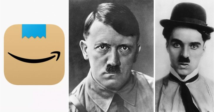
Specifically, users noticed similarities between the new logo and the toothbrush mustache popularized by Hitler. After getting unfavorable feedback from users, the company tweaked the logo a little. A spokesperson of the company said:
“Amazon is always exploring new ways to delight our customers. We designed the new icon to spark anticipation, excitement, and joy when customers start their shopping journey on their phone, just as they do when they see our boxes on their doorstep.”
The app logo featured a brown cardboard box with a strip of tape posted on the top center. The blue tape, which is placed above the signature smiling arrow, resembled the mustache of the famous historic character.

Now, the mustache-like tape has been replaced with a piece of folded tape representing the joy of unboxing an Amazon package. But once again, internet users found similarities between the redesigned logo and cartoon character Aang from the movie Avatar: The Last Airbender.
“I know the new amazon app icon is supposed to represent their packages but every time I see it I just see Aang from Avatar smiling at me.”
This is certainly not the first time an e-commerce company was criticized for its logo. A month ago, Myntra had to change its app logo after an NGO’s accusation that it was derogatory and offensive to women, urging the company to ditch the logo. DCP Rashmi Karandikar from the Cyber Crime Department of Mumbai Police said:
“We found that the logo was offensive in nature for women. Following the complaint, we sent an email to Myntra and their officials came and met us. The officials said they will change the logo in a month's time.”
>>> This TV Costs Rs 2.9 Crore, What Makes It Crazy Expensive?
Featured Stories

ICT News - Jun 27, 2026
OpenAI Launches Limited GPT-5.6 Preview Amid U.S. Security Review

ICT News - Jun 16, 2026
Elon Musk Becomes World's First Trillionaire After SpaceX's Record IPO

ICT News - Jun 14, 2026
The Technological Revolution at the 2026 FIFA World Cup

ICT News - Jun 03, 2026
Apple's Liquid Metal Hinge Poised to Deliver Breakthrough for Foldable iPhone...

ICT News - May 29, 2026
New Glenn Rocket Explodes in Massive Fireball During Static Fire Test at Cape...

Mobile - May 24, 2026
iOS 27 Preview: Apple Delivers Its Most Intelligent Siri Yet Alongside Fresh AI...

ICT News - May 08, 2026
Elon Musk Highlights Neuralink Breakthrough with New Surgical Robot for Brain...

ICT News - Apr 13, 2026
DDR4 RAM Prices Finally Fall After Soaring More Than 2,200 Percent

ICT News - Apr 06, 2026
Artemis II Crew Enters Moon's Gravitational Sphere on Historic Day 5

ICT News - Mar 31, 2026
Comments
Sort by Newest | Popular