Google Play Store’s New Design Will Make It Easier For Users To Find Games
Aadhya Khatri - Sep 12, 2019

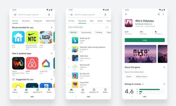
Google Play Store has long been the number one place for Android users to browse new apps, and recently, it has undergone a major design change
- PayTM Launches Made-In-India App Store To Rival Google Play Store
- Indian Government Might Open Its Own App Store As Local Startups Criticized Google Play Store
- Fortnite Is Now Available To Download On Google Play Store
Google Play Store has long been the number one place for Android users to browse new apps, and recently, it has undergone a significant design change.
The revamped appearance is expected to make finding apps on the site easier for two billion active users of the virtual store. However, users who receive the most benefit are the ones who play mobile games often.

Now will have a difference between games and other apps, a move that resulted from the increasing prospect of mobile games. According to a report released this summer by App Annie, this type of online recreation makes up 33% of all installs. While game apps are not where users spend most of their time with nor what they install often, users seem to be more willing to spend their money on them with mobile games’ in-app purchases make up for 74% of consumer spending on apps.
Apart from the new design, Google Play Store has also done a few tweaks to make it easier for gamers to find what they want. A notable change is a brand new landing page with tools, guides, and resources. In 2018 Instant App tech for games was released, which lets users play what interested them before purchasing.
Cineholic and bookworms have also benefited from Google’s upgrade to its Play Store. Along with apps and games, we now have separate categories for movies and books. Those who access the store via a mobile device will notice a new navigation bar, while users of Chrome OS and tablets will also have left navigation.
Google has been working for a while to come up with this new design, and finally, it is now official.
According to Boris Valusek, design lead of Google Play, the new look follow the Material design language with many user-facing updates for a more premium and cleaner store, as well as improving accessibility and app discovery.
Featured Stories

ICT News - Apr 13, 2026
DDR4 RAM Prices Finally Fall After Soaring More Than 2,200 Percent

ICT News - Apr 06, 2026
Artemis II Crew Enters Moon's Gravitational Sphere on Historic Day 5

ICT News - Mar 31, 2026
DDR5 RAM Prices Finally Easing: Relief for PC Builders in 2026

ICT News - Mar 29, 2026
FTC Takes Action Against Debanking Practices by Major Financial Firms

ICT News - Mar 27, 2026
Palantir CTO Identifies Iran Conflict as First Large-Scale AI-Driven War

ICT News - Mar 24, 2026
OpenAI on the Brink: Major Setbacks Signal the Bursting of the AI Bubble

ICT News - Mar 20, 2026
Top 10 Most Popular Social Media Sites Based on User Count in 2026

ICT News - Mar 19, 2026
Billion Dollar Blunder: Meta Shuts Down Metaverse After Wasting $80,000,000,000.00

ICT News - Mar 18, 2026
X to Introduce Regional Controls for Posts and Replies

ICT News - Mar 17, 2026
Is DLSS 5 Helping Games or Hurting Developers' Creative Style?
Read more

Mobile- Apr 19, 2026
Samsung Cuts Galaxy S26 Series Prices by Up to ₹19,000 in India
If you are planning to upgrade, this is a good time to check the latest offers on your preferred model.
Comments
Sort by Newest | Popular