Former Apple Engineer Creates iPhone Software That Apple Will Definitely Want To Have
Ravi Singh - Jan 06, 2019

In a recent video, Former Senior of Apple has introduced a brand new type of environmentally-lit user interface for iPhone.
- iPhone 18 Rumors Suggest a Significant RAM Upgrade to 12GB
- iPhone 18 Pro Kicks Off Apple's Sweeping Camera Improvement Initiative: What to Expect in Future Models
- Apple Insider Claims Cost-Cutting Downgrades Are Coming to iPhone 18
Welcoming the New Year 2019, Bob Burrough - an Apple's ex-employee - recently posted a striking video on his YouTube Channel flaunting a new idea for iPhone's interface that he's developing.
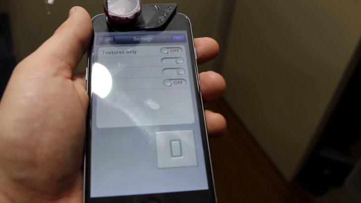
“Project Erasmus” is an implementation of user-interface (aka UI) that shades the objects based on the lighting of the environment where the device is in. Let's find out about this amazing visual effect and you will understand why it’s worth trying!
Check it out:
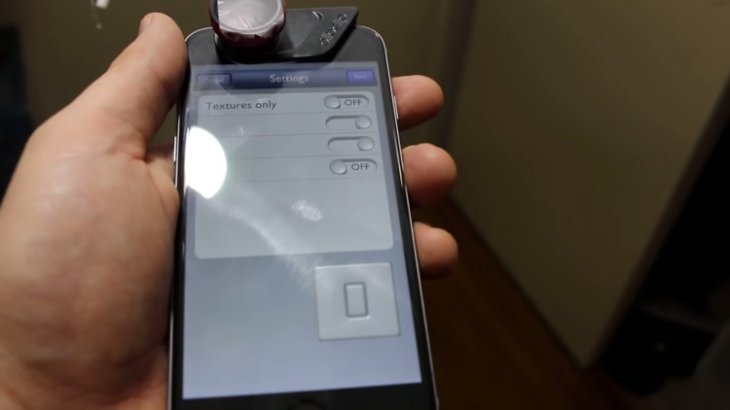
Burrough has set a demonstration of the Project Erasmus to illustrate how it works in the reflection of the light from the environment that the device is in.
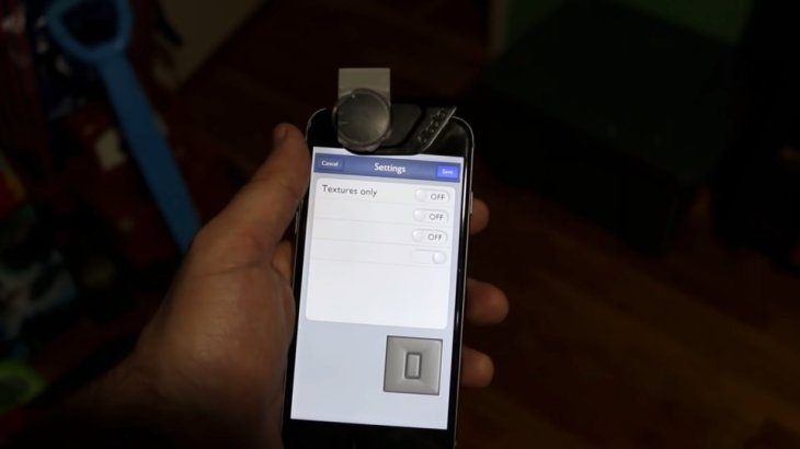
When this man rotates the device around, the UI elements respond slowly to light from different angles and adjust proper brightness as well as contrast.
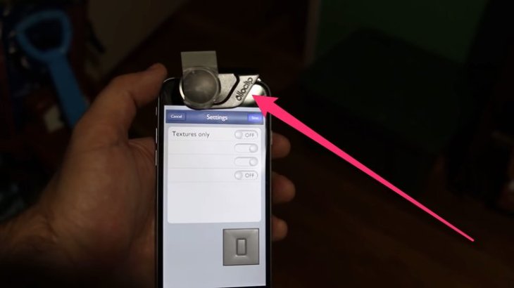
The program projects that as a specular reflection in a scene which then has an effect on the UI elements by constructing reflection of light.
In order to illustrate the effect of lighting to the interface, Burrough has moved all over the house under different light conditions.
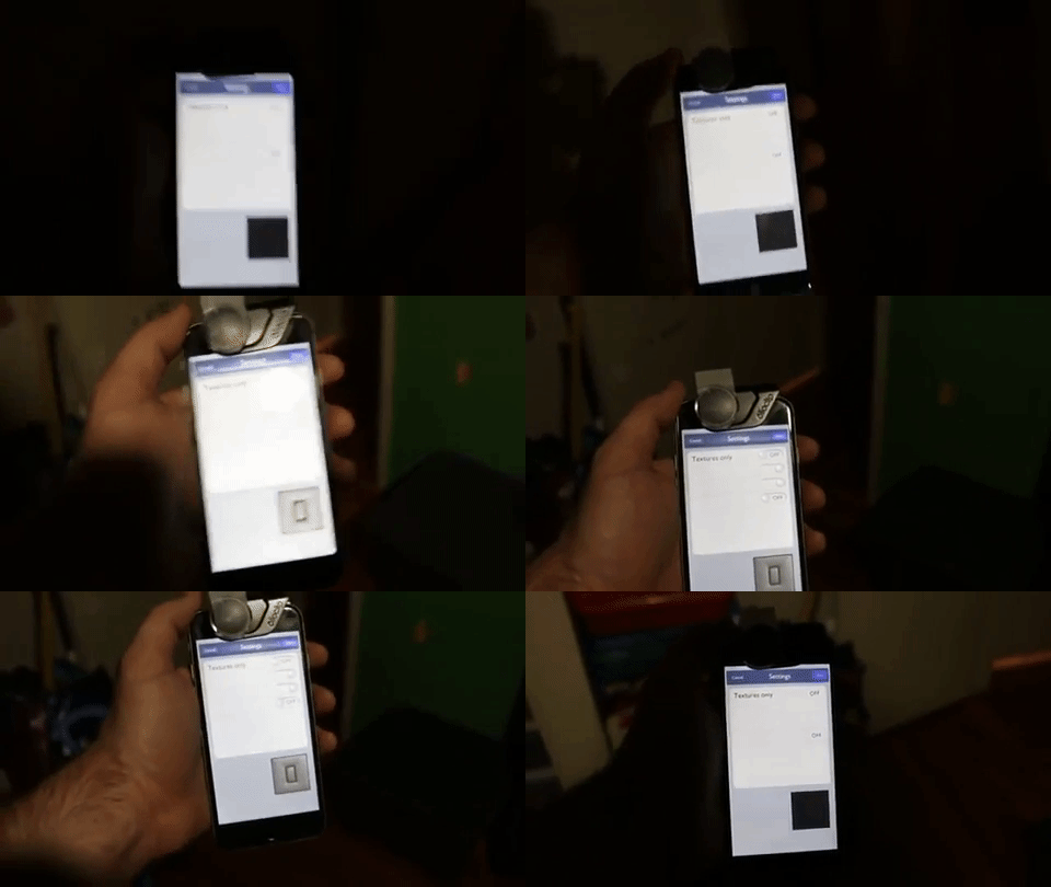
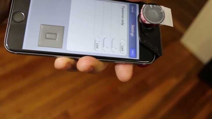
Different light levels will create different effects on the shadow screen. When darkness descends over the device, the UI buttons entirely disappear and all you can see is a black square.
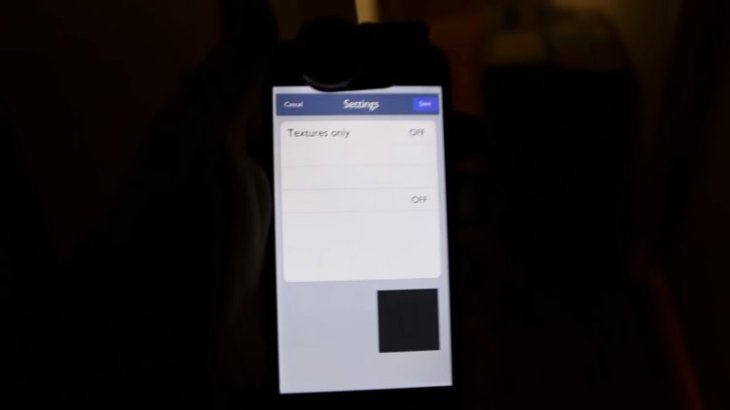
It's totally up to the UI designers if they want it to be that flat implementation like the picture above while there's no light. However, users don't have to do it that way; they could try other more entertaining features such as rendering a backlight behind these elements just like it would on a MacBook Pro keyboard in a low-light environment.

Right after he marches out of the dark, the user-interface immediately responds to the light.
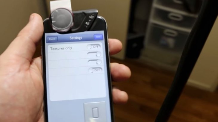
Under a better light condition, this software hikes up the luminosity to prevent shadow screen and bring on the light which improves visibility.
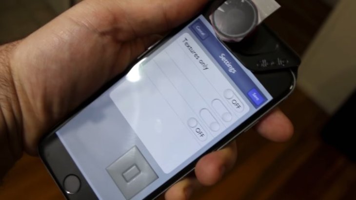
It can be easily seen that the shadows change with the user's movement. Also, coming from other direction, the highlights have created a sharply defined 3D effect.
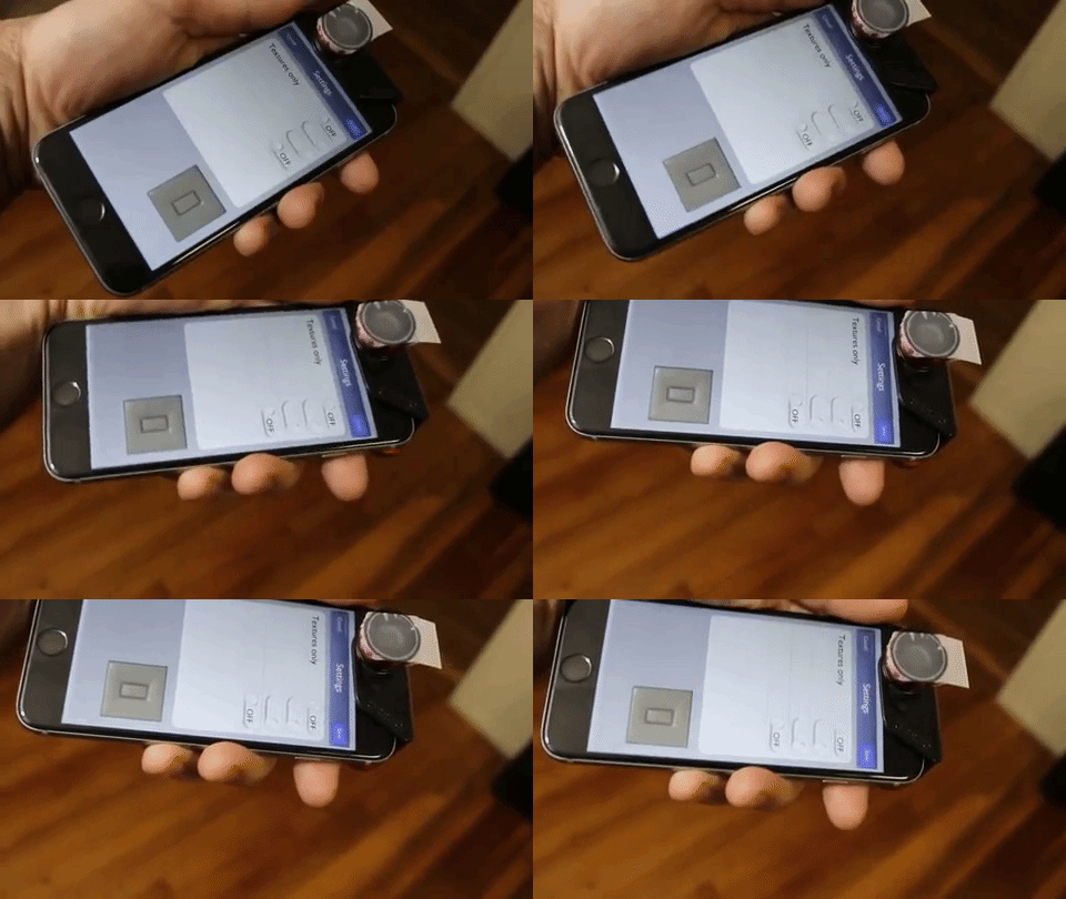
The concept of implementing a new stage of immersion is what any of us expects to witness in our smartphone.
Among iOS 7’s visual trick creating user-interface animation and effects, the parallax effect was considered one that was well received by users. This effect, in fact, is no great shakes but glossing glitter that creates depth and creates hierarchy and order. Just like the parallax effect, Burrough's concept might stimulate users if it’s perfectly applied on smartphones.
Featured Stories

Gadgets - Mar 08, 2026
Best Budget Keyboards of 2026

Gadgets - Feb 27, 2026
Top Budget-Friendly WiFi Routers for 2026

Gadgets - Feb 25, 2026
Top 4 Budget Rechargeable Wireless Mice

Gadgets - Feb 24, 2026
3 Budget Monitors That Reduce Eye Strain and Improve Productivity

Gadgets - Jul 21, 2025
COLORFUL Launches iGame Shadow II DDR5 Memory for AMD Ryzen 9000 Series

Gadgets - Jun 23, 2025
COLORFUL SMART 900 AI Mini PC: Compact Power for Content Creation

Review - Jun 18, 2025
Nintendo Switch 2 Review: A Triumphant Evolution Worth the Wait

Gadgets - Jun 18, 2025
Starlink: Why It’s a Big Deal for U.S. Internet in 2025

Gadgets - Jun 17, 2025
How Custom PC Setups Support India's Esports Athletes in Global Competition

Gadgets - Jun 12, 2025
Lava Prowatch Xtreme Launches with Google Fit Integration
Read more
Mobile- May 03, 2026
Samsung Galaxy S26 vs OnePlus 15T: Which Compact Flagship Wins in 2026?
Which phone are you leaning toward? Let us know in the comments.
Comments
Sort by Newest | Popular