Facebook Releases The App Messenger 4 With The Simplified Design
Jyotis - Oct 24, 2018

Facebook designs a new look for Messenger 4 - simpler and more modern.
- Billion Dollar Blunder: Meta Shuts Down Metaverse After Wasting $80,000,000,000.00
- Instagram Launches A Lite Version For Users In Rural And Remote Areas
- Australia Passed New Law That Requires Facebook And Google To Pay For News Content
Realizing that Messenger gets more and more complicated than it used to, Facebook decides to bring a new simpler version to its users. Instead of nine tabs as in the previous tabs, Messenger 4 will have only 3 tabs: Chats tab, People tab, and Discover tab.

Of which, Chats tab will display all of your conversations (both of one-to-one and groups); People tab helps you search for friends, follow the breaking news from other Facebookers and see who’s online.
Facebook Stories are designed as small circles in Chat tab and larger tiles in People. In other words, users can update the new Facebook Stories from these two tabs.
The third tab, Discover tab, is the place where you can look for the latest deals or update the news. In Messenger 4, Discover tab houses Games (Games used to be a separate tab).
The new version of Messenger doesn’t only possess the more modern design, but it also brings a lot of new features. One of these features is Camera feature that enables users to take shots more rapidly and share images more conveniently.
Moreover, Dark Mode is another new feature in Messenger 4. If you don’t want to be dazzled when using your smartphones for a long time, this feature is for you. Also, a new color gradients feature gives users much more choices when they want to make some differences for their own conversations.
Featured Stories
Mobile - May 03, 2026
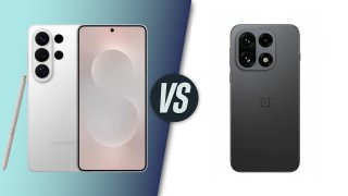
Samsung Galaxy S26 vs OnePlus 15T: Which Compact Flagship Wins in 2026?

Mobile - Apr 29, 2026
Stop Trying to Make the App-Less Phone Happen: The ChatGPT Phone Is Already DOA

Mobile - Apr 27, 2026
RGB Notification Lights Make a Triumphant Return on Xiaomi's Poco X8 Pro

Mobile - Apr 26, 2026
Google Pixel Battery Scandal Illustrates Why Capacity Rules the Smartphone Market

Mobile - Apr 25, 2026
iPhone 18 Rumors Suggest a Significant RAM Upgrade to 12GB

Mobile - Apr 23, 2026
iPhone 18 Pro Kicks Off Apple's Sweeping Camera Improvement Initiative: What to...

Mobile - Apr 22, 2026
Apple Insider Claims Cost-Cutting Downgrades Are Coming to iPhone 18

Mobile - Apr 21, 2026
Huawei Mate X7 Review: Foldable Photography Without Compromises

Mobile - Apr 19, 2026
Samsung Cuts Galaxy S26 Series Prices by Up to ₹19,000 in India

Mobile - Apr 14, 2026
Samsung Ocean Mode: Does It Make Your Galaxy Phone Waterproof?
Read more

ICT News- May 08, 2026
Elon Musk Highlights Neuralink Breakthrough with New Surgical Robot for Brain Implants
As Neuralink advances, the focus remains on making the technology accessible to more people who could benefit from it.
Comments
Sort by Newest | Popular