Microsoft Redesigned Logo Icons For Windows And Other Products
Anil Singh - Dec 13, 2019
Shapes and gradients of those new logos really make users satisfied.
- The Ultimate Tech Betrayal: OpenAI's Nuclear Revenge Plot Against Sugar Daddy Microsoft
- Microsoft Notepad Gets Major Update: Bold Text, Hyperlinks, and Markdown Support
- Microsoft Surface: A Shift from Innovation to Stability?
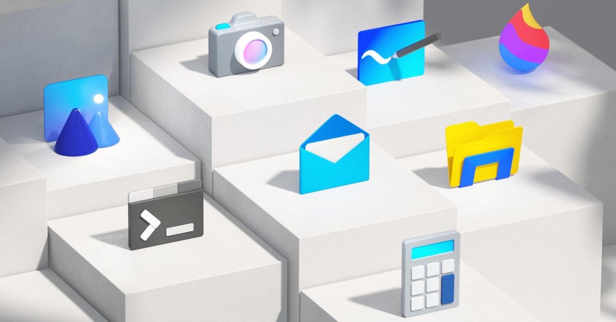
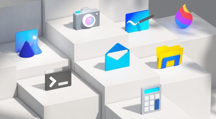
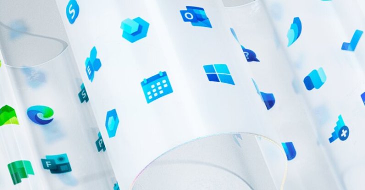
In 2017, Microsoft first introduced a new design package called Fluent Design for its software lineup, but it’s not until now that we have a chance to take a closer look at this new aesthetic system. The company once announced a suite of new icons for Office in late 2018, and now it officially confirms that more than 100 redesigned icons have been projected to arrive in many apps and services offered by Microsoft.
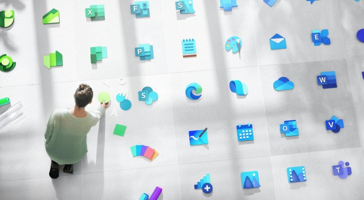
Like some icons for Office we’ve mentioned above, new icons have been attached with a combination of soft edges, gradients, and depth. In comparison with the old designs which has been available since the launch of Windows 8. The new revamp gives those icons a more tangible, 3D feel. Furthermore, Microsoft expects to roll out this icon suite for not only current, familiar products like Windows but also future HoloLens and Xbox.
According to The Verge, the announcement of the new Windows logos took the same place with the Windows 10X introduction. The new logo for Windows 10X in the image below shares a lot of similarities with the current logo, but we can notice soft gradients with slightly rounded corners that the new one incorporates now. The change is just a subtle but it’s welcome.
In other words, Microsoft talked about its five components that it primarily focused on, including material, motion, depth, light, and scale. Shapes and gradients of those new logos really make users satisfied. Microsoft hasn’t yet to reveal the exact launch date for the arrivals of its new logo suite, but it says they’ll come soon.
Featured Stories

ICT News - Dec 25, 2025
The Visibility Concentration Effect: Why Half the Web Isn’t Qualified Anymore

ICT News - Jul 05, 2025
Windows 11 is Now the Most Popular Desktop OS in the World

ICT News - Jul 02, 2025
All About Florida’s Alligator Alcatraz: A Smart Move for Immigration Control

ICT News - Jun 25, 2025
AI Intimidation Tactics: CEOs Turn Flawed Technology Into Employee Fear Machine

ICT News - Jun 24, 2025
Tesla Robotaxi Finally Hits the Streets: $4.20 Rides That'll Make You Hold Your...

ICT News - Jun 24, 2025
World's First Flying Humanoid Robot Takes Flight

ICT News - Jun 24, 2025
When Closed Source Met Open Source: Bill Gates Finally Meets Linus Torvalds After...

Gadgets - Jun 23, 2025
COLORFUL SMART 900 AI Mini PC: Compact Power for Content Creation

ICT News - Jun 22, 2025
Neuralink Telepathy Chip Enables Quadriplegic Rob Greiner to Control Games with...

ICT News - Jun 20, 2025
Comments
Sort by Newest | Popular