Android Auto Gets New Design, New Default Dark Mode
Anil - Jun 01, 2019

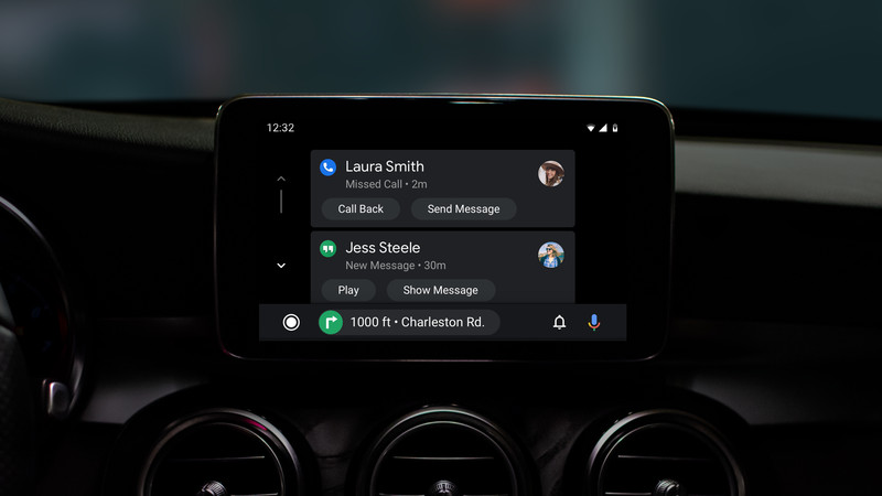
With the refresh, Android Auto lets other apps essentially take over a section and allows more controls without the need of switching to anything.
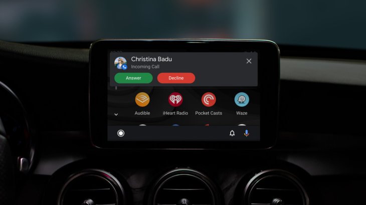
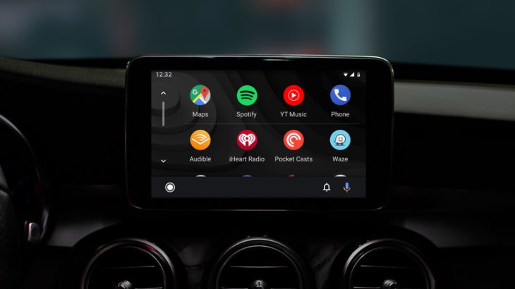
This week, ahead of the I/O developer conference, Google has announced about a new variant of the Android Auto, a smartphone-powered system. It will get a little refresh to become more actionable and more intuitive with fewer taps requiring users to do the things. Besides, the Android Auto is supposed to feature another default theme – in dark mode.


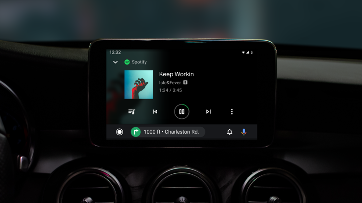
One among all highlights of the new design is nothing but a dynamic menu bar right below it. Prior to this, there were white buttons staying on a dark background. The redesigned bar also supports support for Google Assistant with one tap aso it’s easier to have a reach as well.

With the refresh, Android Auto lets other apps generally take on a section and allows more controls without the need of switching to the full window.
For instance, in case you’re having the full view, the navigation taskbar will prompt controlling buttons for those compatible apps such as Spotify. Furthermore, when you are using the app to head to a place, but you do not have your app opened full on the menu.
Featured Stories

ICT News - May 08, 2026
Elon Musk Highlights Neuralink Breakthrough with New Surgical Robot for Brain...

ICT News - Apr 13, 2026
DDR4 RAM Prices Finally Fall After Soaring More Than 2,200 Percent

ICT News - Apr 06, 2026
Artemis II Crew Enters Moon's Gravitational Sphere on Historic Day 5

ICT News - Mar 31, 2026
DDR5 RAM Prices Finally Easing: Relief for PC Builders in 2026

ICT News - Mar 29, 2026
FTC Takes Action Against Debanking Practices by Major Financial Firms

ICT News - Mar 27, 2026
Palantir CTO Identifies Iran Conflict as First Large-Scale AI-Driven War

ICT News - Mar 24, 2026
OpenAI on the Brink: Major Setbacks Signal the Bursting of the AI Bubble

ICT News - Mar 20, 2026
Top 10 Most Popular Social Media Sites Based on User Count in 2026

ICT News - Mar 19, 2026
Billion Dollar Blunder: Meta Shuts Down Metaverse After Wasting $80,000,000,000.00

ICT News - Mar 18, 2026
X to Introduce Regional Controls for Posts and Replies
Read more

ICT News- May 08, 2026
Elon Musk Highlights Neuralink Breakthrough with New Surgical Robot for Brain Implants
As Neuralink advances, the focus remains on making the technology accessible to more people who could benefit from it.
Comments
Sort by Newest | Popular